
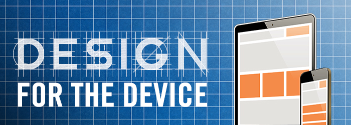
Website design is about more than just having the sleekest, flashiest thing on the market, it’s about functionality. Above all, your site has to be useable, and that’s even more critical for your mobile site.
I’ve talked before about mobile optimization and different tips & tricks for boosting optimization. A lot of people tend to think that the “mobile” version of their website is simply a shrunken-down desktop version. But that’s not quite true, because there are some site elements that simple don’t translate very well from desktop to mobile.
Which ones are they? Good question.
Rotating Banners
This is a bit of double-whammy, because rotating banners don’t actually convert very well on desktop or mobile. However, while desktop click-through rates usually hover around 1% (with the lion’s share of the clicks going to Position 1 on the banner), mobile CTRs can be even lower.
Another huge reason that rotating banners should stay off your mobile site? Load time. Since about half of your site visitors will only wait 2 seconds for a page to load before leaving, those high-res sliders might cost you qualified traffic.
Printable Coupons
This is a classic desktop-to-mobile disaster. Printable coupons are a wonderful way to create a little incentive to come visit your dealership, but there’s one problem. Nobody prints from their phone, and if they’re looking at your coupon on their mobile device, the odds are pretty good that they’re nowhere near a printer.
This is where the eWallet functionality steps in and saves the day. A mobile site that integrates with Apple Pay and Android Wallet will let your users download & store coupons digitally. If you’re smart, you can set up a geo-fence to alert users when they’re near your dealership and can redeem the coupon. Customers download the coupon once, and you can update as many times as you wish.

Layers & Popups
There’s the old saying, “Less is more,” and it often applies to website design. Technology has advanced so far in the past decade, that designers & programmers have almost unlimited options at their fingertips when building a website. That doesn’t mean they should include everything, though.
Sites often use layers and popup features to highlight a chat window, or maybe some social media share buttons. Whatever you use them for, your mobile device screen is too small for that kind of digital real estate.
If your desktop site is seeing great results from the chat popup, that’s great. But take it off your mobile site, because it does little more than impede the browsing experience. It only takes a swipe of the finger to leave your mobile site, so don’t encourage people to bounce off your site by making it hard to scroll around.
Busy Navigation
Your navbar has all the essentials, and sometimes a little extra. For desktop site visitors, it’s critical to have easy, functional, and robust navigation so that all your content is easily accessible.
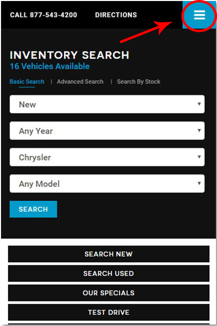
But mobile sites? There’s no need for all that content. The “hamburger” style menu lets you collapse the non-essentials out of sight, where they can be accessed with a quick tap.
Of course, your essential still need to be front and center. Put things like your phone number and your hours & directions into neat little icons on your navbar, and make it sticky if you’re feeling fancy. By doing so, users can take action with ease and they don’t have to go hunting for your “Contact” page or try and copy/paste your phone number.
Two Columns
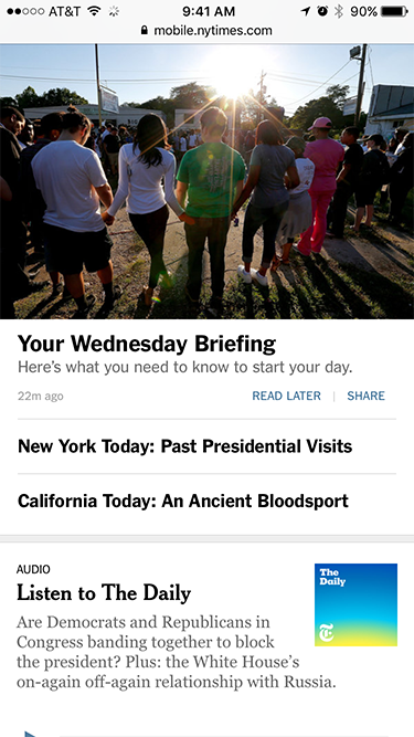
Desktop sites can look amazing with multiple columns, but it’s not a good feature on mobile. Why? The same reason we nixed the mobile popups: digital real estate. A smartphone simply doesn’t have enough screen space to afford a two-column design, so users end up trying to scroll to the left and right to see all your content. No good.
A single-column site will use large, clickable panes to display content – like the mobile version of the New York Times above. Notice how the user doesn’t need to swipe left or right to access content, it’s all right there, optimized for their device. No need to zoom in, either, since the single-column makes sure everything is sized correctly.
The Bottom Line
When you really get down to it, people are using their phones to shop & price-check. So let them do it on your site. Don’t make mobile design an afterthought and assume that the truly loyal customers will simply remember to find your site on their desktop.
Google has consistently shown us that people, especially automotive shoppers, are doing their research in micro-moments throughout their day…and they’re not usually near a computer. So if the future is mobile, then where are you?