When users visit your dealership’s site they want to get right to the point. They want to know what’s in stock and what features your vehicles have and they don’t want to waste time. That’s why most visitors are immediately drawn to your search widget.
You have a lot of choices when it comes to your in-site search options, so there are a couple of questions you should be asking. How specific do you want your search options to be? How should it appear on a desktop versus a mobile browser? What exactly are my users searching for?
But don’t worry, I’ve done the hard work for you. I researched different search options and found some of the pros and cons.
Open Search Fields
A simple way to add a search option to your site is with an open search field. Similar to a regular internet search bar, only this widget would be specific to your website. This a simple option, since visitors can search for anything that they come up with, however if a search isn’t specific enough, or even too specific, it will spit out zero results. Site visitors might think you don’t have what they’re looking for, and then your potential customers become frustrated and your dropoff rates skyrocket.
Very few sites utilize open search fields, preferring instead to offer a few search variables. We found in a recent study that the majority of searches performed with an open search field were on stock numbers. This means open search fields are only really being used by dealership employees, rather than by clients. Probably not the best way to make a sale.
So What Search Fields Do I Include?
If you do decide to be more specific with your search option, you’ll need to know what fields to include. Fortunately for you, again, I already did the research and found which fields users prefer. I’ve listed them below from most to least important:
- Model
- Year
- Make
- Body
- Price
Desktop vs Mobile Browsers
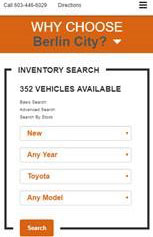
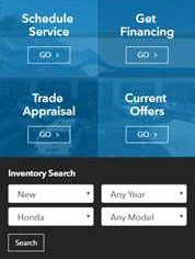
In today’s technological age, you always want to consider mobile browsers when making decisions about your site. Your search option should look different on your desktop browser versus your mobile, starting with its shape. As we know, desktops are horizontal rectangles while mobile phones are viewed as vertical rectangles (usually). Take these different formats into consideration when designing your site and choosing your search widget.
We know that search widgets are used more often on phones than on desktops, so it’s important to make your search option easy to find immediately upon entering your site.
Here are some good examples:


Your search option is a frequently used tool on your dealership’s site, and is sometimes the first step a visitor takes to becoming a lead. Remember to use familiar fields and to optimize for mobile browsers so you can create an easy, enjoyable experience for your site visitors.
It’s much easier to give your customers options to choose from when searching for their next vehicle, because the odds are pretty high that they won’t type with 100% accuracy, or remember every single trim level for every single car they’re researching.
As with most things regarding your website, you never want to make potential customers do more work than they have to, and filtered site search, along with the best practices I’ve outlined here, is a great way to lighten the load.
