All Posts By

Mike Somerville

Website Conversion 101: In-Site Search Options

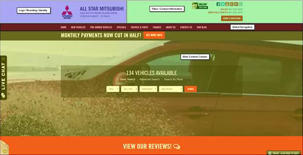
When users visit your dealership’s site they want to get right to the point. They want to know what’s in stock and what features your vehicles have and they don’t want to waste time. That’s why most visitors are immediately drawn to your search widget.

You have a lot of choices when it comes to your in-site search options, so there are a couple of questions you should be asking. How specific do you want your search options to be? How should it appear on a desktop versus a mobile browser? What exactly are my users searching for?

But don’t worry, I’ve done the hard work for you. I researched different search options and found some of the pros and cons.

Open Search Fields

A simple way to add a search option to your site is with an open search field. Similar to a regular internet search bar, only this widget would be specific to your website. This a simple option, since visitors can search for anything that they come up with, however if a search isn’t specific enough, or even too specific, it will spit out zero results. Site visitors might think you don’t have what they’re looking for, and then your potential customers become frustrated and your dropoff rates skyrocket.

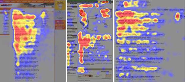
Very few sites utilize open search fields, preferring instead to offer a few search variables. We found in a recent study that the majority of searches performed with an open search field were on stock numbers. This means open search fields are only really being used by dealership employees, rather than by clients. Probably not the best way to make a sale.

So What Search Fields Do I Include?

If you do decide to be more specific with your search option, you’ll need to know what fields to include. Fortunately for you, again, I already did the research and found which fields users prefer. I’ve listed them below from most to least important:

  • Model
  • Year
  • Make
  • Body
  • Price

Desktop vs Mobile Browsers

In today’s technological age, you always want to consider mobile browsers when making decisions about your site. Your search option should look different on your desktop browser versus your mobile, starting with its shape. As we know, desktops are horizontal rectangles while mobile phones are viewed as vertical rectangles (usually). Take these different formats into consideration when designing your site and choosing your search widget.

We know that search widgets are used more often on phones than on desktops, so it’s important to make your search option easy to find immediately upon entering your site.

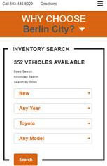
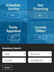
Here are some good examples:

Your search option is a frequently used tool on your dealership’s site, and is sometimes the first step a visitor takes to becoming a lead. Remember to use familiar fields and to optimize for mobile browsers so you can create an easy, enjoyable experience for your site visitors.

It’s much easier to give your customers options to choose from when searching for their next vehicle, because the odds are pretty high that they won’t type with 100% accuracy, or remember every single trim level for every single car they’re researching.

As with most things regarding your website, you never want to make potential customers do more work than they have to, and filtered site search, along with the best practices I’ve outlined here, is a great way to lighten the load.

Website Conversion 101: Banner Blindness

You’ve heard of the blind leading the blind, but maybe you haven’t heard of the blind ignoring your web banners. It may not be a global epidemic, but it’s a problem every website owner should be aware of, especially since banners are becoming more and more popular and necessary.

But what exactly is banner blindness? It’s when site visitors either consciously or unconsciously ignore banners, or even anything that looks like a banner. There could be a lot of reasons why your banner is being ignored. Maybe its distracting and disruptive to the flow of the site, or maybe it breaks a user’s concentration.

Most users ignore banners if it distracts from their purpose for being on the site in the first place, which means not only is your banner not working, but now your users can’t navigate your site!

So how do you avoid banner blindness? Keep these four key points in mind and your banners will stay relevant and useful.

Placement

It’s important to put your banner in a place where it will be the most helpful. We’ve mentioned before that users read a webpage from left to right, top to bottom, so place your banner in these optimum “read areas” to get the most out of it. Also keep in mind that users rarely seek out information that’s not right in front of them. Be sure the banner is in their direct line of vision, not in their peripherals.

If you use multiple banners on different pages, keep their placement consistent throughout your site. This will help with navigation and avoid confusion.

Design

A successful banner balances blending in to its surroundings with drawing attention. Your banner should appear like it belongs with the rest of your site, but still stands out with contrasting colors, fonts, or shapes. Play with these details until you have a banner that meets both of these qualifications.
Something that’s easy to misuse while designing your banner is animation. It is possible to walk the fine line between subtle, eye-catching animation and something distracting and out of place. Too much animation can lead to a negative association with your site—something every website owner should avoid.

Content

Now that you’ve captured the attention of your users you can focus on what it’s saying. The content of your banner should be relevant to the page it’s on. There’s no need to include a coupon for an oil change on your About Us page; this may distract from the purpose of the page.

The last piece of content on your banner should be your CTA (call-to-action). We’ve talked about the importance of CTAs before, and the importance of having a clickable button that brings site visitors closer in the purchase process. Your CTA should encourage some kind of action, such as “Get 10% Off Service” or “Receive a Gift Card with Test Drive.” Adding time-sensitive words like “Now” can also help drive a sense of urgency. This will create a need where clicking your banner brings about a solution.

Usefulness

Even if you keep all of these points in mind, your banner won’t achieve anything if it’s not useful. Your banner should help your users during their visit and avoid distraction. This is even more important if your visitor is using a mobile app. These banners should be easy to read, easy to tap, and short enough that it doesn’t push all your content out of sight.

Keep these points in mind to make your banners as natural and non-disruptive as possible to avoid banner blindness. Banners can be a useful tool if used properly, but if your site visitors have gone blind to them they won’t do you much good!

Website Conversion 101: Homepage

In a previous post, we talked about website optimization as a general concept and laid out some ground rules for A/B testing to gauge how visitors interact with your site. Driving traffic to your site is a worthwhile effort, but it can quickly become worthless if you never track which buttons are being clicked, which pages are being viewed, and what path your customers are taking to conversion.

Now, it’s time to get specific, so let’s talk about how to optimize your homepage.

Layout

Odds are, your homepage is the most heavily trafficked page on your website, so content matters a lot. Most can be separated into four different sections, which you can see below:
Top right header – Logo, Branding, & Identity
Top left header – Titles & Contact Info
Lower header – Global Navigation
Below header – Main Content

Every site will be organized slightly differently, but for the most part, that’s the universal template. Your mobile homepage will have a variation of the same layout as well.

Headers

Your homepage’s headers act a bit like a driver’s license for the page. They tell the visitor what site they’re on, what page they’re viewing, and how to get in touch with your dealership – all the basics. Consistent headers actually help people interpret webpages as part of your website. For example, consistent headers would tell someone that your service page and a vehicle detail page both belong to the same website, even though the content on the two pages is quite different.

Logos & Branding

Within your headers, logo and branding consistency is also a key part of homepage optimization. And just like with headers in general, it’s the absence that speaks volumes. A website with a different headers & logo placement on each page would be extremely hard to navigate, frustrating users.

Moreover, having logos that aren’t hyperlinked to the homepage can contribute to that confusion as well. Again, being able to navigate from page to page (or get back “home”) is a function that most people come to expect now.

Additionally, your logo should always be in the top left part of your header, paired with your dealership’s title.

Contact Information

In the olden days of website design, you would include a “Contact” link in the site’s footer, and your address & location were only visible after someone clicked through. While the “Contact Us” page is absolutely necessary, your address and phone number should also be spelled out in the top right header area.

Instead of hiding your contact info on an internal page, display it at the very top of each page.

Global Navigation

Lots of websites (not just car dealer websites) rely on form submissions as a main source of internet leads. When site visitors want to interact with your dealership, they’re most likely going to fill out a form, exchanging some information for an appointment, a phone call, or maybe a coupon.

So then, site navigation is incredibly important to optimizing for conversion, as are CTAs. As the heatmap below illustrates, most users read in an “F-pattern” and take in data from left to right, top to bottom – reading less and less as they scan down the page.


What does that tell us? Put all your pertinent links and CTAs in the red areas, where people’s eyes are naturally going.

As far as global navigation goes, we see the best results when dealers put their “Home,” “New Cars,” and “Used Card” pages on the left hand side of their navbar, and the “About” and “Contact Us” pages on the far right.

And here’s an extra tip: using a “home” icon on the navbar can help lower the number of people who click there as a “reset” strategy. Why? An icon is more subtle than plain text, and therefore a little less noticeable. Users are more likely to leave your website after resetting to your homepage, so you don’t want to disrupt the conversion process if at all possible.

While it’s not usually a good idea to use icons in place of text (it can get very confusing, very quickly), the “home” icon can help guide user flow to a CTA that your dealership has found to have a high conversion rate. To put it simply, don’t make it any easier than it already is for potential leads to get distracted and bounce off your site.

Extra Tips & Tricks

  • Popups can be a high-volume lead producer when the offers are compelling and promise a savings or coupon.
  • Any vehicle search function on your homepage should be above-the-fold.
  • Eliminate any unnecessary widgets, as they increase site load time.
  • Use drop-down inventory search bars when possible, as they’re still the #1 search method for car shoppers.
  • Make any “floating” chat boxes static.
  • Use colored vehicle photos on your model bar, white/silver are the least-clicked colors.
Call support
(877) 543-4200
Call Sales
(877) 543-6321