

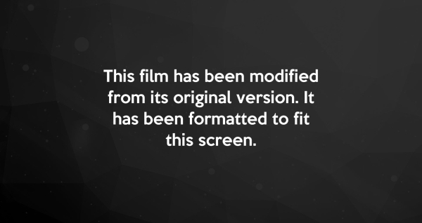
Remember that little screen that shows up right before a movie plays? It says “This film has been modified from its original version…” Why is that important? Well, formatting makes the difference between a super stretched-out image on your TV and a nice, square fit where you can actually see what’s going on.
It’s what makes the aliens in Independence Day look just as scary on your TV at home as they did in the theater.
Your websites are the same way (or, at least, they should be). They need to be formatted for mobile platforms, large-scale displays (like TVs and giant monitors), tablets, desktops, etc. Otherwise, your customers will get lost in the transition…or lack thereof. But there are some potholes along the way that some companies get themselves stuck in if their website provider isn’t using RESS methods correctly.
In this blog post, we’ll talk about making the most out of your dealership website, and how to tell when your site isn’t as compatible with multiple devices as it should be. Yes, this is a longer post than usual, but the technical details here are invaluable, and we’ll point out some things you might not have noticed about your site.
Now, this isn’t new technology, but it’s been largely ignored by dealerships, so let’s figure out what went wrong.
But I Don’t Know Anything About Building Websites…
While dealers definitely don’t need to be experts on web coding, let’s at least make sure you know enough to be dangerous – and know when you’re not getting the most out of your website. Let’s get started with RESS methods, shall we? You’re going to see a lot of terms like seamless/adaptive and responsive in this post. These all mean that your website loads quickly and correctly on all different types of devices & platforms, and we’ll break it down further in the sections below, don’t worry.
RESS (Responsive Web Design with Server-Side Components) is a type of web coding method that makes all this possible. When you’re looking to re-do your site(s) or optimize it to improve web traffic, you want to make sure the company you choose is throwing around terms like RESS and RWD (Responsive Web Design). Again, this simply means that they know how to make your website look & load the best, no matter what device your customer is using.
A lot of companies claim to provide seamless web design, but many of them don’t do it very well.
They either 1) have a “one-size-fits-all” program that squeezes your entire site (and all its buttons) onto a tiny screen or 2) create a mobile site that’s impossible to navigate because it’s too busy.
The problem is this: You want a mobile-friendly site that offers all the same functionality, but in a smaller platform. For example, if you have a widescreen banner at the top of your website with text of varying sizes, how’s that going to shrink down to a phone-sized screen? Probably something like this:

You always want your customers to be able to navigate your site and have an enjoyable experience.
The Importance of a Responsive Website
To make a long story short, you want your site to be responsive.
Consider all the different messages your website sends, either with text on the screen or buttons for your customers to click:
- … “Click Here”
- … “Call Us Today”
- … “Get Pre-Financed Today”
If your website isn’t using responsive coding, then when a customer visits your site on, say, his phone, he might not see all of the relevant information.
On that note, being mobile-friendly is a big deal, and Google rolled out changes to their search engine in 2015. Essentially, they started telling people that mobile-friendly sites were getting “extra” rank points in the search engines.
That means if Bob Jones Honda of Nashville and Tom Smith Honda of Nashville have websites, but only one of them is mobile-friendly, guess who’s getting put at the top of the list? Yep, the one with the mobile-friendly site. Got the picture?
The Importance of an Adaptive Website
But there’s more to it than that. To get a truly optimized website working on all platforms, it needs to be adaptive as well. Your site should know whether it’s being viewed on a smartphone, a tablet, or a laptop, then tailor the content displayed as needed.
For example, you probably don’t need your entire site to load onto a mobile platform, just the necessary stuff. Your showroom doesn’t have every model in your inventory on display, does it? Nope, it’s a lot more interesting to look at a Corvette or a Camaro than the latest and greatest Tahoe.
In terms of website development, think about all the giant graphics your site uses and then imagine them on a smaller screen. An adaptive website knows when to trim the fat, so to speak.
If this isn’t true of your website, that’s a problem.
Get ‘Em Both – With No Sacrifices
Now that we’ve covered that stuff, let’s recap and talk about how to get your agency, your vendor, or your sister’s cousin who codes in his basement to do both without sacrificing anything. After all, the least you can do is make it easy on your customers who are trying to research and buy their vehicles online.
Here’s what we think: a dealership shouldn’t need an MIT graduate on staff to be able to tell when their site isn’t working up to its potential. If your “mobile” website is just a shrunk-down version of your main site, then odds are you have problems you’re not seeing. That’s an issue that can be fixed using proper RESS methods. But again, a lot of companies will only promote how fast they can get your site to load on a mobile platform. That’s cool, but what about all the other stuff we mentioned?
Hopefully, you were able to read this post and get a better understanding of what to ask from your web marketing company.
DealerOn prides itself on the vast amount of experience in this area and we’re not afraid to share what we know. Most companies in the industry take the approach of “Leave the tech stuff to us,” but we find it’s more valuable if a dealership actually understands what it’s paying for. After all, that’s why we test drive cars, right?
If you have any questions about this content (there’s a lot of it), email me at michael@dealeron.com and I’d be happy to explain further.