


5 Things That Don’t Go On Your Mobile Site (and 5 Things that Do)
If you’ve been living under a rock, then you might not know that people are starting to use their mobile devices for browsing websites more than they use their desktops. That’s right, all that information and data, shrunk down onto a tiny phone or tablet screen. But mobile and desktop platforms aren’t interchangeable, and there are certain site elements that convert well on desktop, but not on mobile. In fact, there are things you should probably never put on your mobile site. Lucky for you, that’s what this post is all about!
Quick Stats
Website Visits
Toward the end of 2016, internet browsing on mobile in the US reached an all-time high of 48%, and it actually surpassed desktop usage worldwide with 51.3% of people using their mobile device to access websites. Naturally, DealerOn did its own research for consumer behavior within the automotive industry, and we also found that desktop was being surpassed by mobile. No surprise there.
In January 2013, about 75% of website visitors were coming from desktop, while less than 20% were coming from mobile. Fast forward to January of 2017, and a little more than 40% of site visits were from desktop, while nearly 50% were from mobile.
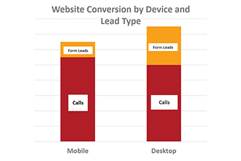
Conversation Rates
Overall, mobile conversion rates still have a long way to go before they catch up with desktop. In fact, studies show that overall mobile conversion rates aren’t even half of desktop’s rates. However, looking at lead type, you can see that mobile actually garners more call conversions than desktop, but fewer form submissions.
So let’s talk about what kinds of things you should be putting on your mobile site, and what kinds of things you shouldn’t.
5 Things to Avoid
“Print Coupon” buttons
For desktop, this is a great CTA for those customers who want a physical reminder of the deal they’re getting. But, guess what? Nobody prints from mobile, and it’s much easier to simply store a digital coupon on your phone via an eWallet offer. Depending on the person’s device, they can receive a notification when they’re near your business, or when it’s time to redeem it.
Form Submissions
Everyone loves a good form to fill out, right? Not on mobile, they don’t. In the website optimization world, this is what’s known as “friction,” which is real or perceived difficulty navigating your mobile site. What’s the easiest, most intuitive thing to do on a phone? That’s right, make a call. Click-to-call CTAs are much more effective on mobile devices than a traditional form fill. This obviously doesn’t apply to every situation, but you should generally avoid having form submissions on your mobile site if they can be replaced with a click-to-call button.
Rotating Banners
Your banners are big and beautiful, sure, but you’ve only got your customers’ attention spans for a few precious seconds. Do you really want them waiting 3-4 seconds per slide? If your site has more than 3 rotating banners, the click-through-rates for the 3rd banner banner and beyond drop significantly compared to the first two. This hurts your shoppers’ site experience.
Banners with too much information
That’s what landing pages are for. If you’re spending all your efforts in cramming as much info into a banner advertisement, consider putting that kind of detailed work into the landing page. After all, your leads will simply bounce if they click on a banner ad and don’t find the information they were promised (e.g., 50% off new purchase, BOGO, etc).
Popup Ads and Layers
There’s not really a nice way to put this…popup ads on a mobile site a terrible idea. They’re extremely hard to dismiss, and create frustration with your site visitors. Layered boxes are also a big no-no on mobile, for the same reason. Navigability is a huge part of your mobile site’s ability to convert, and if screen space is taken up by intrusive popups or layers, customers can’t navigate. When they can’t navigate, they leave.
5 Things to Include
Google Maps link
In general, your customers are in a hurry and they want their information NOW. Put your “map” icon up at the top and make sure it has “Directions” text next to it, or something to indicate what it is. You might think that icons are universal, but they’re not. Then, make sure you actually link to Google Maps, and not your own form where your customer has to input their address.
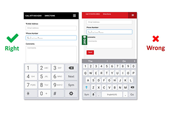
Mobile Forms with Custom Input Types
If the input fields on your mobile site include things like “telephone number” or “price amount,” then set the appropriate input when designing the form. Nobody likes to type on their phone, and this makes it much easier for your customers to type in their info and move on. Putting unnecessary barriers in between a potential lead and a your business is never wise.
eWallet Coupons
Earlier, we said that you should avoid “print coupon” buttons on your mobile site, and instead use eWallet offers. Here’s why. Studies have shown that eWallet offers have a 10x better redemption rate than printed coupons, meaning customers actually use them. They automatically integrate with Google and Apple’s native wallets, plus they generate a unique and trackable SKU for your analytics. Best of all, they create a sense of loyalty with your customers.
Geo-Location Ads
Take advantage of today’s technology (if your website provider supports it) and serve specialized offers for users in specific locations. If your business is trying to target someone around, say, a college campus, you can use a geofence or set parameters on a map to serve people in that area a unique advertisement.
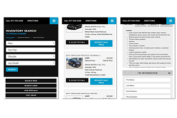
Sticky Nav: Phone & Address
Like the image here shows, make sure that your contact info is always visible, no matter what page your customer is looking at. If you’ve followed our directions about using text & icons together, then this should make things easy for site visitors looking to contact your business. Even if they scroll down, the navigation bar (or navbar) stays at the top of the screen for maximum visibility.
Happy Optimizing!
If you’re looking for more tips on mobile site optimization, then stick around. We’ll be writing more blog posts about how to give your customers the most out of their mobile site experience. In the meantime, go through this list and make sure your mobile site is up to snuff.