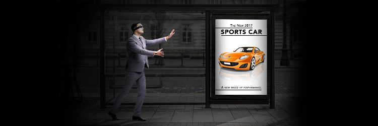

You’ve heard of the blind leading the blind, but maybe you haven’t heard of the blind ignoring your web banners. It may not be a global epidemic, but it’s a problem every website owner should be aware of, especially since banners are becoming more and more popular and necessary.
But what exactly is banner blindness? It’s when site visitors either consciously or unconsciously ignore banners, or even anything that looks like a banner. There could be a lot of reasons why your banner is being ignored. Maybe its distracting and disruptive to the flow of the site, or maybe it breaks a user’s concentration.
Most users ignore banners if it distracts from their purpose for being on the site in the first place, which means not only is your banner not working, but now your users can’t navigate your site!
So how do you avoid banner blindness? Keep these four key points in mind and your banners will stay relevant and useful.
Placement
It’s important to put your banner in a place where it will be the most helpful. We’ve mentioned before that users read a webpage from left to right, top to bottom, so place your banner in these optimum “read areas” to get the most out of it. Also keep in mind that users rarely seek out information that’s not right in front of them. Be sure the banner is in their direct line of vision, not in their peripherals.
If you use multiple banners on different pages, keep their placement consistent throughout your site. This will help with navigation and avoid confusion.
Design
A successful banner balances blending in to its surroundings with drawing attention. Your banner should appear like it belongs with the rest of your site, but still stands out with contrasting colors, fonts, or shapes. Play with these details until you have a banner that meets both of these qualifications.
Something that’s easy to misuse while designing your banner is animation. It is possible to walk the fine line between subtle, eye-catching animation and something distracting and out of place. Too much animation can lead to a negative association with your site—something every website owner should avoid.
Content
Now that you’ve captured the attention of your users you can focus on what it’s saying. The content of your banner should be relevant to the page it’s on. There’s no need to include a coupon for an oil change on your About Us page; this may distract from the purpose of the page.
The last piece of content on your banner should be your CTA (call-to-action). We’ve talked about the importance of CTAs before, and the importance of having a clickable button that brings site visitors closer in the purchase process. Your CTA should encourage some kind of action, such as “Get 10% Off Service” or “Receive a Gift Card with Test Drive.” Adding time-sensitive words like “Now” can also help drive a sense of urgency. This will create a need where clicking your banner brings about a solution.
Usefulness
Even if you keep all of these points in mind, your banner won’t achieve anything if it’s not useful. Your banner should help your users during their visit and avoid distraction. This is even more important if your visitor is using a mobile app. These banners should be easy to read, easy to tap, and short enough that it doesn’t push all your content out of sight.
Keep these points in mind to make your banners as natural and non-disruptive as possible to avoid banner blindness. Banners can be a useful tool if used properly, but if your site visitors have gone blind to them they won’t do you much good!


