

The Internet is a big place. It can be scary, it can be offensive, and it can be weird. But it can also be the best way to connect with a customer base that might never even know you exist. The key is your homepage.
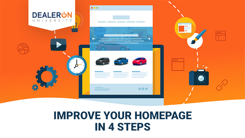
There are four easy steps you can take to make your homepage sing.
1. Introduce yourself
The first step is making it abundantly clear to anyone who visits your site who you are and what you do. Sounds basic, right? It’s shocking how many companies get that precisely wrong. Imagine that no one has heard of you, and that a visitor somehow landed on your homepage by mistake. Think of the quickest, cleanest, easiest way to explain who you are. Cut it all down to the basics. In the movie business, they have what’s called the “elevator pitch.” Essentially, the idea is that you get into an elevator and there’s Steven Spielberg. You have the duration of that elevator ride to sell him on your movie. You cut out every extraneous detail, smooth over every subplot, and tell him only the most interesting, relevant facts. Are you the cheapest dealership on the market? Are you a fixed price shop? Do you offer great deals on trade-ins? What makes your dealership uniquely you? Now convey that on your homepage.
2. Give your customers what they want
Remember, your homepage doesn’t exist in a vacuum. Your site speaks directly to your customers. When designing your homepage, think about what they want. Put yourself in the heads of a person from your community who is in the market for a new or used vehicle. What are their concerns? Is the area suffering from a bad local economy? If so, price might be the top concern. Is it a rural location that puts a lot of wear-and-tear on the vehicle? Highlight the service section.
The good news is this isn’t a guessing game and shouldn’t be. While knowing your market and what makes you tick as a dealership is important, you have a tool at your disposal that makes site optimization largely a science. Using analytic tools like Google Analytics, you can see exactly what your customers are doing on your website and that will inform exactly what you should be focused on. As you might expect, no matter what the brand of your dealership is, most car dealerships see very similar traffic patterns. The vast majority of your traffic will be interested in searching for a vehicle (generally skewed towards used). This means that you want to make sure that inventory search and navigation is front and center for your mobile and desktop users. This is followed closely by customers looking to service their vehicles, looking into finance options, and finally specials. Making sure that you are optimizing the location of these important elements so that they are easy to get to for your shoppers is critical.
But even more than that, think about what sort of impression you want to convey. Colors are keyed to certain emotions. Blue, for example, has a calming, professional look. If you’re marketing cars to families, that might be a good color to base your site around. Or are you marketing sports cars to single guys primarily? Go with red and black, aggressive, masculine colors that can show in a subtle way that your dealership wants to put them in a fast car. Or maybe luxury cars are your stock in trade? Think about a design in metallic silver with white. That color scheme screams luxury. Or, more accurately, it purrs luxury over a flute of fine champagne. For many of you, manufacturer mandates around brand compliance mean color won’t be within your control, but by being strategic you can use color to help guide shoppers through your sites.
3. Make your site easy to use on every device
Once you’ve set the stage, you want to make certain this thing is user friendly, and your two major concerns there are what your users are on and where they want to go. For the first, make certain the site is optimized for whatever device your user happens to be browsing on. The most obvious are laptops and smartphones, but who knows what someone might have? Just because a person likes browsing on their tablet like a maniac doesn’t mean they aren’t a potential customer who deserves a good experience.
4. Every call to action should be obvious
For the second, ensure your users know where to go next. Sounds simple, right? It’s not. The goal is to show the user exactly what is expected of them. Make the search bar obvious. Have the menus be easy to find. There’s nothing like losing a customer who can’t navigate your home page.
While all of that might sound overwhelming, it’s not. There are plenty of companies out there (hint, hint) who are more than happy to do it for you. Maybe that’s the best homepage practice of all.