

The curiosity is killing you, we know. What’s the verdict, pods or banners? Well, before we say it’s time to lean towards pods, let’s explain why.
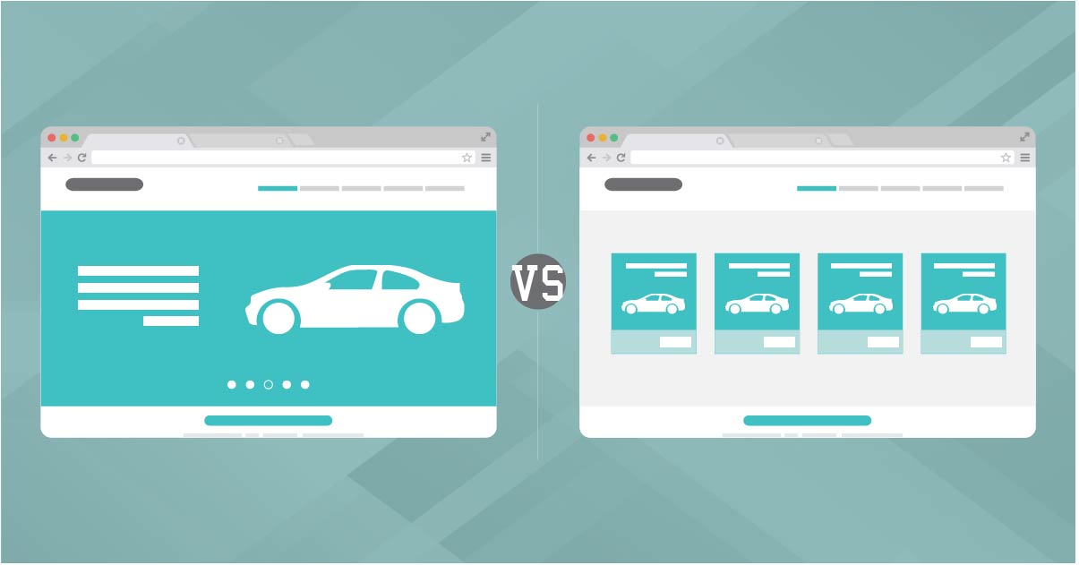
What are pods? Pods are simply larger scale images or hyperlinks that define user flow into a few designated areas on a website. This creates tactical conversion path creation. Pods tend to create the best user experience for a website as they funnel users into your main conversion flows. It’s to the point and simple for the consumer. The best converting pods are in the order of new, used, specials and schedule. An example would be like this one seen on Ancira Buick GMC.
 These images and links simply mimic the navigation bar by offering a quick and simple button for the user to act upon, therefore minimizing your bounce rate. According to an Autotrader study, top activities conducted by online car shoppers included researching car prices, finding actual cars listed for sale and comparing different models. If your webpage consisted of pods, it would be the solution to all those consumer activities. It’s worth nothing, however, that we don’t recommend using pods to market trade-in or finance offers, unless it’s on a pre-owned website, as our own internal data shows very low performance otherwise.
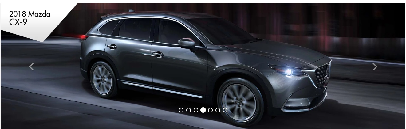
What’s all the fuss about homepage banners, you ask? Homepage banners (sometimes called “sliders”) tend to have 3 to 5 images, with a maximum of 3 images on mobile. An example of a banner would be Fitzgerald Mazda of Annapolis.
According to Autotrader, 46 percent of car buyers use multiple devices to shop. Roughly, over 70 percent of banner clicks are on the first 3 images. The content that will be viewed gets sliced in half, making everything in position 4 &5 nearly worthless. Another con, banners need to be linked within the site to maintain proper user flow. If you want consumers to interact with your most valuable content, focus your time and effort on a static homepage with pods or even a great landing page experience.
Now that we’ve talked about the differences between pods and banners, let’s talk about the end goal, conversion. A DealerOn study on pods vs. sliders, using customer data from 2016 through 2017, showed pods were proven to have a 150 percent increase on their average clickthrough rate than sliders. Sliders had an average clickthrough rate of 1.83 percent while pods had an average of 4.56.
If you ask us, the numbers don’t lie. Pods clearly have a better track record when it comes to CTRs.
But don’t ban banners just yet, they still rake in some benefits. Just keep in mind the placement, content, design and usefulness. If you are going to include a banner, we recommend adding one in the space below your listed vehicles on the inventory page. As moving between inventory pages is such an important aspect of browsing dealership sites, we find that filling the top-of-the-fold with content often distracts from the purpose of the page and can lead to banner blindness. Read more about how to strategize your banners in our previous blog posts, Banner Blindness and Below the Fold Content.
While pods may not be suited to everyone’s needs, they have proven to be effective in generating greater clickthrough and greater conversion rates for the majority.
Next week, we’ll be back with more Website, SEO, and SEM optimization tips to help your dealership get even smarter about selling cars!