


Let’s talk some website optimization. Everyone knows that A/B testing (or split testing) is vital to finding out which elements of your site convert best. It’s the fine art of showing your website visitors variables of things like CTAs, banner ads, click-to-call buttons, and more so that you can pick the ones that performs the very best. But, are you splitting your split testing? That is, are you testing across all platforms?
Doing your split testing on desktop will get you great results for what performs best…on desktop. But what about your mobile website? It’s time to take your split testing up a few notches and start optimizing across all platforms so that conversions can be isolated by device type. This will help deliver the best possible experience for a particular user.

One of the things that we see all the time is website companies running just one A/B test across multiple platforms and, after gathering their data & analyzing, assuming that Mission: Optimization is accomplished. For the reasons I mentioned earlier, it’s not quite that simple. Consider what your mobile users are likely to click on vs. your desktop site visitors, and then start split testing to optimize per platform.
For example, your mobile website probably uses a “click-to-call” functionality that’s very useful for site visitors. Since they’re already on a mobile device, the quickest way to contact your business is to simply call it by tapping on a button. However, desktop visitors won’t find that kind of functionality helpful. Instead, forms are much more likely to convert desktop visitors into qualified leads.
Furthermore, if you use the same A/B testing for all platforms, your results might be skewed. Using the above example, your testing may show a 30% conversion rate on website forms – but your desktop site might have had a 75% conversion rate, while your mobile and tablet sites were at virtually 0%. Just taking that 30% conversion rate at face value isn’t smart, you need to understand where your stats are coming from.

Isolating the platform, then optimizing for conversion will also help give your various customers the best kind online experience possible. With today’s technology, people expect websites that load extremely fast, answer all their questions, and are completely navigable. In another blog post, I’ll talk about a “mobile-first” strategy and what that means for your website, but it’s crucial to consider mobile when running your split tests.
There are lots of different things you can split test on your website to optimize for conversion, but here are two common ones that ought to be split by platform type.

Rotating Banners
This is one area that performs poorly on both mobile and desktop. Though your website theme may allow for scrolling or rotating banners, they typically have very low click-through-rates. In our industry, automotive, even Position 1 on a rotating banner will have less than 0.5% CTR. After that, it goes even further downhill. Of course, when it comes mobile, having a rotating banner is just flat-out impractical. Like I said earlier, people are generally impatient when it comes to websites, and mobile users in particular aren’t interested in waiting around for something that might interest them on a scrolling banner. In fact, your mobile site might not need a banner at all.
Pro tip: capitalize on your site’s real estate by using large, clickable “pods” instead of the rotating banner. You’ll get more clicks, plus be serving multiple messages at the same time.
Landing Pages
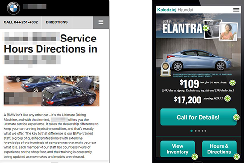
Your landing page has a lot of difference elements on it, which means a LOT of different A/B tests can occur when optimizing for conversion. I won’t break each element down, but your mobile site’s landing pages ought to look very different from desktop. When testing things like your CTAs, for example, be mindful of fitting everything on a much smaller screen. Of course, I’m assuming that you’ve got a responsive platform. Notice the example on the left. The CTA, if there is one, is pushed down below the fold, ensuring that nobody will see it when they land on the page. And in the example on the right, you can see that the landing page has CTAs for both inventory and hours & directions, all visible and enticing.

The word “optimization” gets thrown around a lot, and for good reason. Everyone wants their site to be performing as well as it possibly can, and they want the most for their advertising & marketing dollars. To do that, you need to be testing various elements of your website constantly, and across multiple platforms. If you’re not sure where to start, pick up your phone and try to interact with your own website, maybe try participating in your most recent ad campaign. If your previous A/B testing showed promising results, yet you have a hard time claiming the offer on your website, then you may have done your split testing a bit too broadly. Consequently, don’t forget to analyze mobile traffic apart from desktop in your analytics.