


It’s hard to keep up in the ever-evolving world of mobile devices. Earlier this year we wrote about design features for mobile that should never see the light of day, and all of that is still true, but you still have to figure out what your site should look like when someone’s holding it in their hand. Lucky for you, there are a few design elements that won’t be losing their effectiveness anytime soon. If you stick with them, you’ll be headed in the right direction.
If they can’t call you, what are they doing there?
I could go on and on about the importance of precise, customized CTAs that reflect your product or service, but even with a great CTA on every page, if your visitors can’t call you from their phone, then they won’t be hanging around for long. And I’m not talking about just including your phone number somewhere on the page, I mean an easily clickable button that allows visitors to call you straight from your site.
I know calling is slowly going out of style, but people still recognize that the thing in their hand is a phone, which means a click-to-call button is essential. That’s what phones were made for, after all.
When it comes to images, “big” is in
The screen on your phone is already small, so don’t make things worse with tiny graphics that don’t do your products justice. Show off what you’ve got with clickable, full-width images that lead your visitors further down the buyer’s journey. To get attention from Google, your images should be large enough to easily tap without slowing down load time. Find that balance, and you’re in the sweet spot.


Don’t forget to KISS: Keep It Simple, Stupid
Visitors on mobile aren’t performing the same kind of in-depth research as they would on a computer. They’re looking for the facts and they want them fast, so give the people what they want. Prioritize the information presented on mobile to the essentials for quick browsing, and leave the details to another page. Make your copy on product pages concise and to the point, and layer the rest further down on your navigation bar.
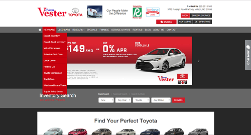
Compare the navigation bar on this home page. On desktop, the navigation drops down to a more detailed inquiry.
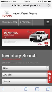
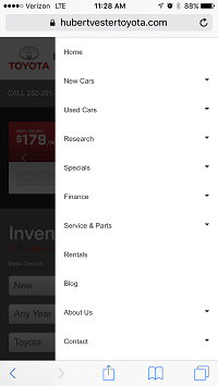
On mobile, the navigation is out of the way to avoid clutter.
Your goal on a mobile browser is to make your visitors’ experiences as frictionless as possible. What may appear detailed on a desktop ends up looking cluttered and overwhelming on smaller devices. Keep your visitors happy by only showing them what matters most. If they’re interested to know more, they can always use your click-to-call button.
Save the “fill in the blank” for a computer
Nobody likes typing on a phone. It’s difficult and awkward and no one’s fingers are small enough to work the tiny buttons without typos. Save your visitors the trouble by limiting the need to type on your pages.
Your search widget is going to be one of your most popular features, so make it easy by offering drop-down selections. If your mobile visitors do make it all the way to a form, you can’t avoid the need to fill it in, so make sure it’s large enough that they can see what they’re doing.
In general, people use their mobile device to find out more about a product. They’re using a convenient tool to get more information, so give it to them in a convenient way. Make your mobile pages easy to navigate with concise copy that focuses on the essentials, and don’t make visitors work too hard to find out what you’re all about. Give them images they can actually see and click, and try to avoid making them type something out. If you follow this advice, you’ll be at a good jumping off point. If you’d like some more details on design for the device, check out our other blog here.